Awareness Post #6 - Takashi Murakami3/24/2018 Murakami is one of the most influential artists in Japan today. He pioneers the art movement dubbed "superflat" and has helped define and create a unique contemporary Japanese style. His work is famous worldwide for it's vibrant colors and psychedelic appearance. Murakami paints, draws, sculpts, animates, and collaborates with big name brands. "727" was painted in 1996 and is considered one of his most influential works. The center of the triptych features a character named Mr. DOB who is a frequent motif in Murakami's work. Mr. DOB is Murakami's effort to create an icon similar to Mickey Mouse or Hello Kitty as Murakami wants to destroy the image of the artist in favor of a character which will survive for far longer. To summarize, Mr. DOB is a critique of modern culture as well as a promotion of its ideals. In the piece, Mr. DOB is revealing his razor sharp teeth and his multiple eyes are maniacally looking around the work. In terms of meaning, DOB is short for "dobozite" which means "why?" and DOB's smile can be interpreted as Murakami's reaction to the art world and the West in general. 727 refers to the Boeing airplanes that flew over Murakami's childhood home in order to reach U.S. military bases during the post-WWIII Japan that Murakami often explores in his artwork. Murakami also takes influences from Hokusai and nihonga in this work with the stylized wave that Mr. DOB sits upon and the style of scraping away layers of paint that he utilized in the background. I love the complexity and the multiple layers of meaning that Murakami infuses into this work. The wave and Mr. DOB's contrast to the scraped off texture of the background is by far one of my most favorite parts of this piece. Contrast seems to be central to Murakami's creation of this work as the elegance of the wave is a distinct opposite to the sharpness of Mr. DOB's teeth. Furthermore, the composition of the work is neither boring nor simplistic with the wave dynamically coming in from the left and the character's off center placement. In terms of critique, I sort of dislike the colors used. I love the white of the wave and how the scraped off purple seems to create a halo around the swirls and emphasizes its shapes. However, the dark blue of Mr. DOB combined with the dark purple around it makes the piece look dark in that area which is not my cup of tea. In addition, the yellow haze in certain areas of the work seems out of place although that may just be my preference. I want to try the scraping off technique in my background as the surface and effect is appealing to me. Additionally, I love the anime-esque and elaborate meanings behind Murakami's work. I want to infuse multiple layers of meaning into my work with whatever I create as well as possibly creating a character of my own as a motif seems like it could connect my portfolio pieces together. 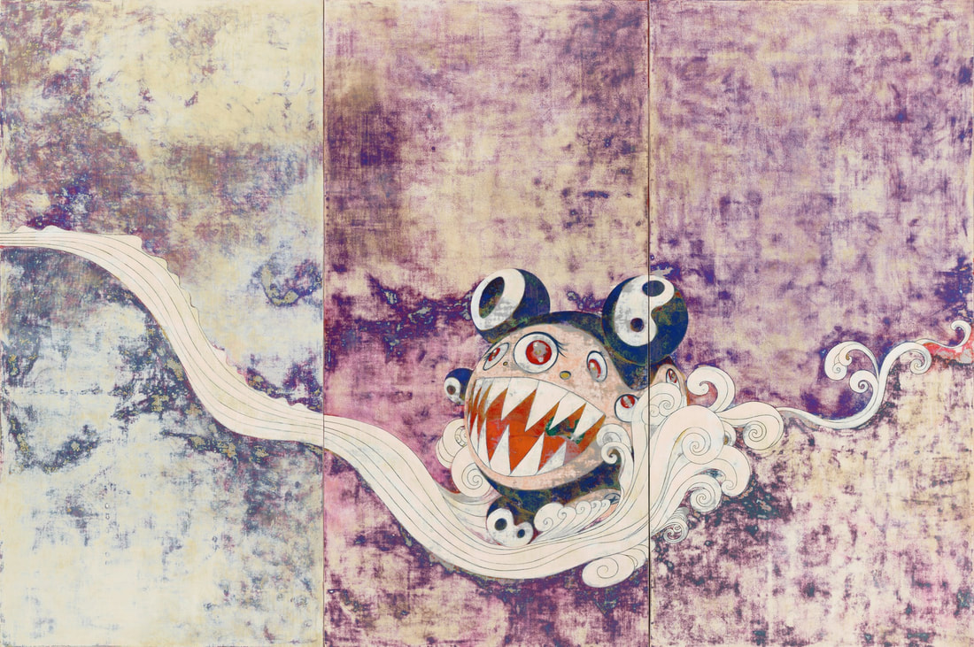 "727," Takashi Murakami, 1996, Synthetic polymer paint on canvas board, 9'10" x 14'9"
0 Comments
Leave a Reply.author.jacqueline. she/her. senior. virginia, usa. art v. archives.
March 2020
categories.
All
|
 RSS Feed
