Progress Post #26 - March 30, 20183/30/2018 This week, I tried to finalize my piece by adding highlights, working on the beads, and touching up the background (although the photos don't show that). I feel like I am incredibly close to finishing although I still need to work on it for at least another hour. The light wasn't that great this week so the piece looks darker than normal. I still have problems with how slow the oil paint dries although I believe I have a better grasp of it as I am no longer blending things I am not supposed to. I think my highlights on the pig are what I am most proud of as it makes the pig look round.
0 Comments
Awareness Post #6 - Takashi Murakami3/24/2018 Murakami is one of the most influential artists in Japan today. He pioneers the art movement dubbed "superflat" and has helped define and create a unique contemporary Japanese style. His work is famous worldwide for it's vibrant colors and psychedelic appearance. Murakami paints, draws, sculpts, animates, and collaborates with big name brands. "727" was painted in 1996 and is considered one of his most influential works. The center of the triptych features a character named Mr. DOB who is a frequent motif in Murakami's work. Mr. DOB is Murakami's effort to create an icon similar to Mickey Mouse or Hello Kitty as Murakami wants to destroy the image of the artist in favor of a character which will survive for far longer. To summarize, Mr. DOB is a critique of modern culture as well as a promotion of its ideals. In the piece, Mr. DOB is revealing his razor sharp teeth and his multiple eyes are maniacally looking around the work. In terms of meaning, DOB is short for "dobozite" which means "why?" and DOB's smile can be interpreted as Murakami's reaction to the art world and the West in general. 727 refers to the Boeing airplanes that flew over Murakami's childhood home in order to reach U.S. military bases during the post-WWIII Japan that Murakami often explores in his artwork. Murakami also takes influences from Hokusai and nihonga in this work with the stylized wave that Mr. DOB sits upon and the style of scraping away layers of paint that he utilized in the background. I love the complexity and the multiple layers of meaning that Murakami infuses into this work. The wave and Mr. DOB's contrast to the scraped off texture of the background is by far one of my most favorite parts of this piece. Contrast seems to be central to Murakami's creation of this work as the elegance of the wave is a distinct opposite to the sharpness of Mr. DOB's teeth. Furthermore, the composition of the work is neither boring nor simplistic with the wave dynamically coming in from the left and the character's off center placement. In terms of critique, I sort of dislike the colors used. I love the white of the wave and how the scraped off purple seems to create a halo around the swirls and emphasizes its shapes. However, the dark blue of Mr. DOB combined with the dark purple around it makes the piece look dark in that area which is not my cup of tea. In addition, the yellow haze in certain areas of the work seems out of place although that may just be my preference. I want to try the scraping off technique in my background as the surface and effect is appealing to me. Additionally, I love the anime-esque and elaborate meanings behind Murakami's work. I want to infuse multiple layers of meaning into my work with whatever I create as well as possibly creating a character of my own as a motif seems like it could connect my portfolio pieces together. 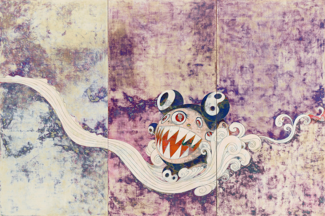 "727," Takashi Murakami, 1996, Synthetic polymer paint on canvas board, 9'10" x 14'9" Progress Post #25 - March 23, 20183/23/2018 This week I worked on adding colors to the flower, the rest of the pig, the butterfly in the candle, and fixing up the background. I feel I made a lot of progress this week as I am much closer to finishing than I was last week. I definitely still need to touch up the background and the highlights on the flower and the butterfly, but I am excited to see how it looks when I finish. I find that how slow the oil paint dries is not working to my favor since I have to work on things quickly, and I often end up accidentally blending colors I didn't want to blend. I hope I get used to the aspect of this paint soon. Awareness Post #5 - Banksy3/21/2018 Ever since 1990, Banksy has fascinated people around the world with their powerful satirical graffiti art and their famed anonymity. Little is known about Banksy besides the fact that they began as a graffiti artist in the early 1990s and gained significant traction in 2006 after celebrities began taking notice of their art. They have engaged in numerous "graffiti wars" and runs an Instagram account with around 2.1 million followers. One of Banksy's most popular works is known as "Balloon Girl." "Balloon Girl" was created in 2002 on the side of an east London shop, and it depicts a child either reaching for or losing her red, heart-shaped balloon. A faded message located near the mural states "THERE IS ALWAYS HOPE." This mural was voted Great Britain's favorite artwork in 2017 through a Samsung poll. Many people believe that the girl is losing her balloon which may signify loss of innocence which is a bleak yet realistic message. I believe that this interpretation falls in line with many of Banksy's other murals (that are reasonably depressing) as well as their later revision of this work that depicted a Syrian refugee in place of the girl. On the other hand, the work may also be interpreted as the girl reaching for her balloon as a sign of perseverance of hope which aligns with the message displayed near it. This optimistic view point also appeals to me as their recreation of it may signify that Syrian refugees should not lose hope despite how terrifying their situation is. I LOVE this mural. In particular, I love the use of selective color in the balloon as it draws attention to it and elevates the balloon's importance. Furthermore, Banksy has always been incredibly talented in displaying forms using dark shadows and this work is no different. The form of the child is entirely suggested by the shadows they use. I have never been good at using shadows to define forms as I rely heavily on contour lines, and I envy Banksy's mastery of this technique. In terms of faults, the face of the little girl is a bit terrifying. Although, only from up close is it very noticeable. She looks angry, which may be due to how her form is portrayed with just shadows, but it still unnerves me as a viewer. Banksy's use of shadows and pops of color are something I want to emulate in my work and incorporate into my pieces as I greatly enjoy how they look in both an aesthetic and communicative way. As Banksy primarily works with stencils, I want to try to see how I can build a complex work with such materials. I have seen videos of people using numerous stencils to accomplish one picture, and I think it looks incredibly tedious but the results are amazing. 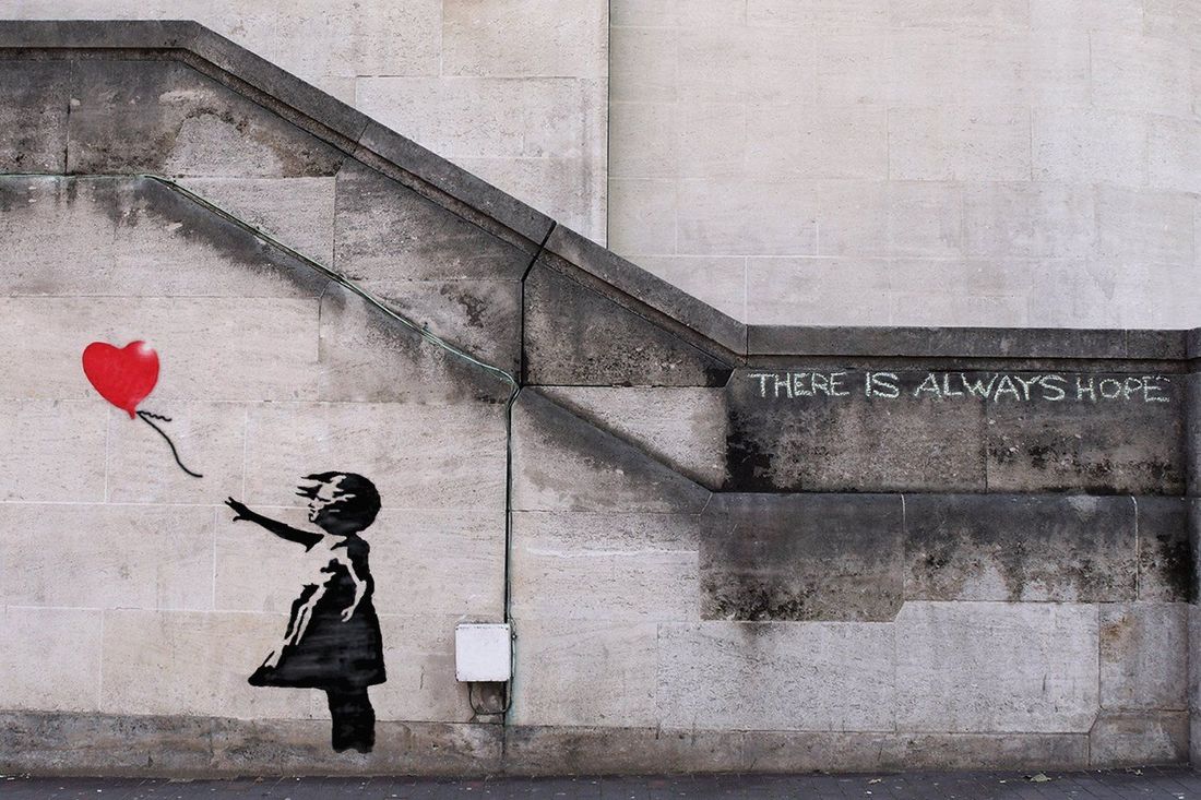 "Balloon Girl," Banksy, Mural, 2002, 122 x 44 cm Progress Post #24 - March 16, 20183/21/2018 This week, I started adding colors to my objects! I think it looks pretty good so far, but I definitely need to fix the whites on the pig. I like the shadows on the base of the butterfly thing as it looks genuinely metallic which is wild. I really enjoy working with oil although it is incredibly tedious and a little difficult to work with. I need to add more shadows in the background because it makes my objects look like they are floating. author.jacqueline. she/her. senior. virginia, usa. art v. archives.
March 2020
categories.
All
|
 RSS Feed
